Most pricing tools we've used stop at the moment you set a price. You enter your costs, get a number, and that's it. The tool has nothing else to offer. When the class ends and you want to know whether your pricing was right, you're back to a spreadsheet or a napkin or a vague feeling that "it worked out okay."
We wanted something better. The Class Price Calculator lets you save a pricing plan before the class starts, come back after it ends to record what actually happened, and see a side-by-side comparison of your predictions versus reality. After a few classes, the tool starts learning from your data and can offer to replace its research-based defaults with numbers that reflect your actual community.
Here's how the whole cycle works.
1 Why Tracking Actuals Matters
Every pricing plan is a prediction. You predict enrollment, you predict how many students will choose each tier, and you predict how much revenue the class will generate. Some of those predictions will be close, and some will be way off. Both outcomes are valuable, because they teach you something for next time.
Without tracking, each class starts from scratch. With tracking, each class builds on the one before it. After three or four completed classes, you stop relying on industry averages and start pricing from your own real data.
Mode note: Class History and the Save/Review workflow live in Advanced mode. If you're in Simple mode, flip the header toggle to Advanced before continuing. Your mode preference is remembered across visits.
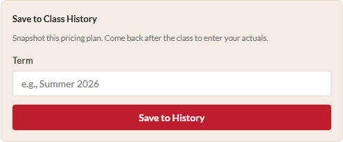
2 Save a Plan to Class History
After you've calculated your scenarios, scroll to the bottom of the results panel (the right side of the screen). You'll find a section called Save to Class History with two fields:
- Term: A label for when this class runs, like "Summer 2026" or "Fall Session A." This helps you find the record later.
- The class name is pulled automatically from the Class Name field at the top of the calculator.
Click "Save to History" and the tool snapshots everything about your current pricing plan: costs, enrollment ranges, buffer percentages, tiered pricing settings, predicted distribution, calculated price, and blended revenue estimate. This snapshot is the "before" picture.
You can save multiple plans for the same class name with different terms. If you're running "Intro to Pottery" every quarter, each quarter gets its own record.
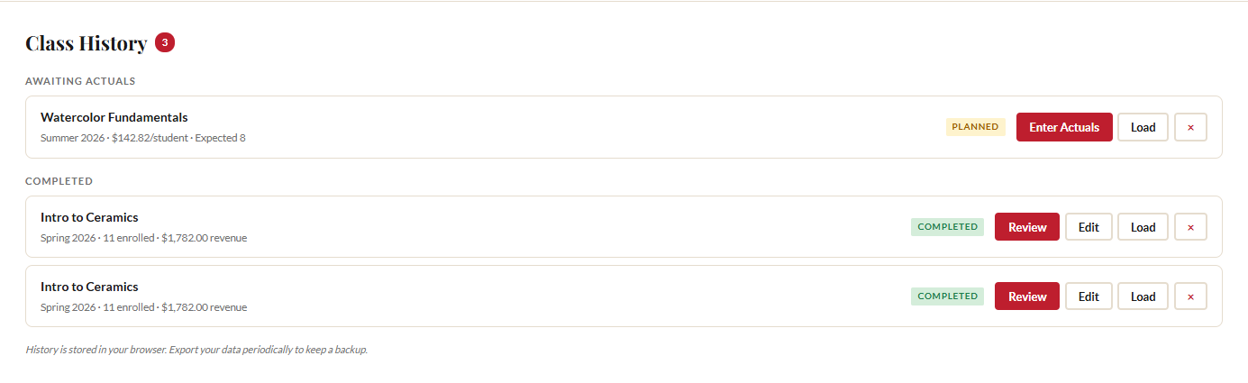
3 The Class History Panel
Once you have at least one saved class, a Class History section appears below the enrollment scenarios. It's divided into two groups:
- Awaiting Actuals: Classes you've planned but haven't entered real data for yet. Each card shows the class name, term, planned price per student, and expected enrollment.
- Completed: Classes where you've entered actuals. Each card shows the class name, term, actual enrollment, and total revenue.
A small badge next to the "Class History" heading shows the total number of records. Each card has action buttons that change based on status. Planned classes show "Enter Actuals" and "Load." Completed classes show "Review," "Edit," and "Load."
Your history lives in your browser's localStorage. No accounts, no servers, no cloud sync. Your data never leaves your machine. It persists across sessions, so you can close the browser and come back next week. Just remember: clearing browser data deletes your history, which is why periodic exports are important (more on that in Step 8).
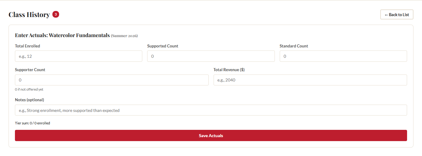
4 Enter Actuals After a Class Runs
When a class finishes, find it in the "Awaiting Actuals" group and click "Enter Actuals." The tool opens a form with five fields:
- Total Enrolled: How many students actually took the class.
- Supported Count: How many chose the supported tier. Enter 0 if you didn't offer tiers.
- Standard Count: How many paid the standard price.
- Supporter Count: How many chose the supporter tier. Enter 0 if not offered.
- Total Revenue: The actual dollar amount you collected.
There's also an optional Notes field for anything you want to remember. "Strong enrollment, more supported than expected" or "Two late drops, refunded one" can be invaluable context when you review the data six months from now.
A sum validation indicator below the tier count fields checks that your Supported + Standard + Supporter counts equal the Total Enrolled. The tier counts must match the total before the tool will accept your data. Click "Save Actuals" and the class moves from "Awaiting Actuals" to "Completed."
5 Edit Actuals If You Need To
Made a mistake? Found a corrected revenue number from your bookkeeper? Click "Edit" on any completed class to reopen the actuals form with the previously entered data pre-filled. Change what you need and save again. The comparison view updates immediately.
You can also click "Edit Actuals" from within the comparison view itself. No need to go back to the list first.
6 Read the Comparison View
On any completed class, click "Review" to open the comparison view. This is where planning meets reality. The comparison shows four data points with color-coded deltas:
- Enrollment: Predicted versus actual, with a delta showing how many students you were off by. A green +2 means you enrolled two more than expected. A red -3 means three fewer.
- Revenue: Predicted versus actual revenue with a dollar delta. If you predicted $2,000 and earned $1,850, you'll see -$150 in red.
- Predicted Split: The tier distribution percentages you used when planning (e.g., 25% Supported, 65% Standard, 10% Supporter).
- Actual Split: The real tier percentages based on your actual counts, with deltas measured in percentage points. If you predicted 25% supported but 30% actually chose supported, you'll see +5pp.
Green deltas mean you did better than expected. Red deltas mean you fell short. Neither is inherently good or bad. Both are information that makes your next pricing plan more accurate.
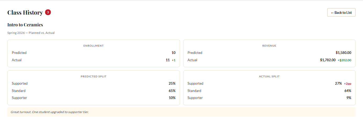
If you entered notes, they appear below the comparison data.
7 Aggregate Learning
This is where the tool gets genuinely smarter over time. Once you have three or more completed classes that used tiered pricing, the calculator computes your real average tier split across all those classes. A card appears at the top of the Class History section titled "Your Data," showing:
- How many completed classes contribute to the average
- Total students across those classes
- Your real average Supported / Standard / Supporter percentages
Below the percentages, a note reminds you of the research default (25/65/10) and a button reads "Use My Data as Default." Click it, and the tool updates the Predicted Distribution fields in the tiered pricing section to match your actual numbers.
From that point on, every new class you price will use your real community data instead of Panera Cares averages. This is the payoff for tracking actuals consistently: better predictions, better pricing, less guesswork each time.
8 Export and Share Your History
Because everything lives in localStorage, regular backups are important. Click "Export JSON" to download a file containing all your inputs, settings, and complete class history.
This same export file enables team collaboration. If someone else is involved in pricing decisions, they can import your file and see the full history. When they import it, the class history merges with anything they already have. Records are matched by ID: if you exported a "planned" record and later export a "completed" version of the same class, the import upgrades the local copy automatically.
For more detail on the full export/import workflow, see our guide to exporting, importing, and sharing data.
Recommendation: Export your data at least once a month, or any time you enter actuals for a completed class. Keep the file somewhere safe, like a shared Google Drive folder or a Dropbox. It takes five seconds and protects months of accumulated learning.
Ready to price your next class?
Open the Class Price Calculator and put this guide into practice.
Open the Calculator