If you've already gone through the Quick Start, you know how to get a price in five minutes. This guide goes deeper. We're going to walk through every section, every toggle, and every analysis panel in the Class Price Calculator so you understand exactly what each feature does and when to use it.
We'll use the same watercolor class from the Quick Start as our running example: a 6-session watercolor class, 2 hours per session, with an expected enrollment of 8 students. By the end, you'll know how to use tiered pricing, generate tier language for your registration page, and track your actual results after the class ends.
A note before we start: the tool opens new users in Simple mode, which shows the essentials only (Class Info, Direct Costs, Target Margin, Cost Breakdown, recommended price). Most of this walkthrough (risk buffers, tiered pricing, sustainability tables, predicted distribution, reverse calculator, class history) lives in Advanced mode. Flip the segment toggle in the header to Advanced now, and the surface expands. Your preference is remembered across visits. Note that risk buffers still apply to calculations even when their controls are hidden: the Moderate preset (25% instructor, 15% materials, 20% coordinator, 10% other) runs by default, and each Cost Breakdown row labels its buffer inline so you can see what's applied.
This is the comprehensive one. Take your time.
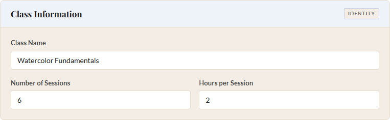
1 Class Information
The Class Information section sits at the very top of the left panel. It has three fields, and one of them is the most important field in the entire tool.
Class Name is the one required field. Nothing calculates until you type something here. It doesn't need to be the final name you'll use on your registration page. "Spring Watercolor" or "Test Class #3" both work fine. The calculator uses this name when you save a pricing plan to your class history, so pick something you'll recognize later.
Below the class name, you'll find two number fields side by side:
- Number of Sessions: How many times the class meets. For our watercolor example, that's 6. You can enter anything from 1 to 100.
- Hours per Session: The duration of each meeting, including any setup and cleanup time you want to account for. We'll use 2 hours. You can enter half-hour increments (1.5, 2.5, etc.), and the range goes from 0.5 to 24.
These two fields drive the instructor cost calculation when you're paying hourly. Sessions times hours times the hourly rate equals the instructor line item. Get these right and the rest of the math follows.
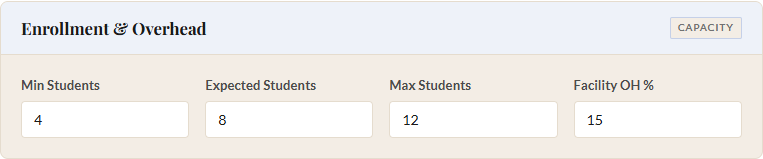
2 Enrollment and Overhead
This section has four fields arranged in a row. The first three are enrollment numbers, and the fourth is your facility overhead percentage.
Min Students is the smallest class you'd be willing to run. Below this number, you'd cancel. Expected Students is your realistic best guess for how many will actually register. This is the number the calculator uses to set your recommended price. Max Students is your hard cap, whether that's limited by studio space, fire code, or the number of easels you own.
For our watercolor class:
- Min Students: 4
- Expected Students: 8
- Max Students: 12
The calculator generates an enrollment scenario for every number from minimum to maximum. This is one of the tool's most valuable features: instead of a single price, you see a complete table showing revenue, costs, profit, and margin at every enrollment level. That table appears in the Enrollment Scenarios section after you click "Calculate Scenarios."
Facility OH % (Facility Overhead) is the percentage of direct costs you want to add for venue-related expenses: rent, utilities, insurance, cleaning, Wi-Fi for the check-in tablet. If your organization runs ten programs a month and this class is one of them, in our experience 10-15% is a common range. The default is 15%, which is what we'll use.
The overhead percentage is applied to your total direct costs after buffers. So if your buffered direct costs are $800 and overhead is 15%, the tool adds $120 for facility costs.
One thing to know about the expected enrollment field: the tool automatically keeps it within range. If you set min to 6 and max to 12, the expected enrollment will clamp itself between those two values. You won't accidentally price for 20 students in a class that caps at 12.
3 Direct Costs
This is where you tell the calculator what the class actually costs to deliver. There are four cost categories, plus a catch-all for anything that doesn't fit neatly.
Instructor
You'll see a toggle with two options: Hourly Rate and Flat Rate. Most of us pay instructors by the hour, so Hourly is the default. When you enter a rate, the calculator multiplies it by sessions and hours per session to get the total instructor cost. For a flat-rate arrangement (say, $500 for the entire series), flip the toggle and enter the flat amount instead.
- Instructor Rate: $50/hour (Hourly mode)
Remember to include setup and cleanup time in your Hours per Session if your instructor needs it. A 2-hour class with 30 minutes of setup and 30 minutes of cleanup is really 3 hours of paid time. You set that back in Step 1.
Materials
Another toggle here: Total vs. Per Student. Use Total when you buy supplies in bulk for the whole class, like a set of shared reference books or a bag of clay for the studio. Use Per Student when each participant gets their own kit. The calculator multiplies per-student costs by the expected enrollment automatically.
- Materials: $15 per student (Per Student mode)
This distinction matters for the scenarios table. Per-student materials cause total costs to rise with enrollment, while total (fixed) materials stay flat regardless of how many students show up.
Coordinator Hours and Coordinator Rate
Somebody handles registration, sends reminder emails, orders supplies, and deals with the inevitable "can I switch to the Tuesday section?" questions. Enter the estimated total hours and the hourly rate. For our watercolor class:
- Coordinator Hours: 2
- Coordinator Rate: $25/hour
If you're a solo teaching artist doing your own admin, still fill this in. Your time has a cost even when you're not writing yourself a check. Pricing as if your labor is free is the fastest way to make a class unsustainable.
Other Direct Costs
This is a single dollar field for anything else specific to this class: model fees, kiln firing charges, a guest speaker, special equipment rental. The hint text says "e.g., live model fees, specialty supplies." Enter the total dollar amount. For our watercolor class, we'll leave this at $0.

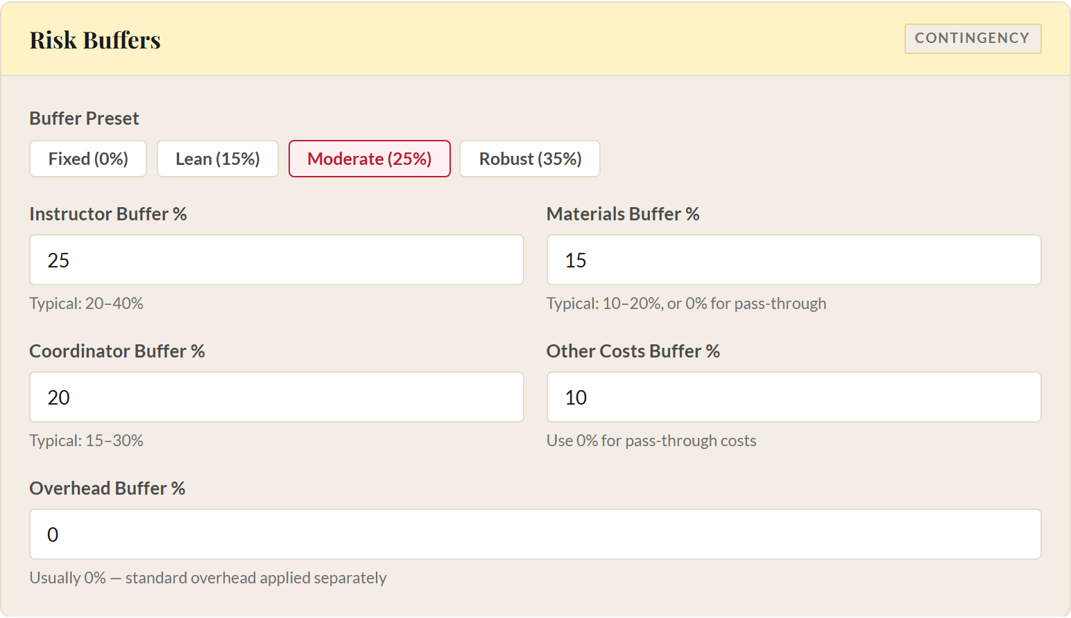
4 Risk Buffers
Things go sideways. A student drops and you issue a partial refund. Supplies cost more than the quote you got last month. The instructor needs a substitute for one session at a higher rate. Risk buffers are the contingency you build into the price so these surprises don't eat your margin.
Each buffer is a percentage added on top of the corresponding cost category. A 25% instructor buffer means you're pricing as if instructor costs might be 25% higher than your estimate. You're not expecting them to be higher. You're just making room in case they are.
Buffer Presets
If you don't want to set each buffer individually, click one of the four preset buttons:
| Preset | Instructor | Materials | Coordinator | Other | Overhead |
|---|---|---|---|---|---|
| Fixed (0%) | 0% | 0% | 0% | 0% | 0% |
| Lean (15%) | 15% | 10% | 15% | 5% | 0% |
| Moderate (25%) | 25% | 15% | 20% | 10% | 0% |
| Robust (35%) | 35% | 20% | 25% | 15% | 0% |
Fixed is for situations where every cost is contractually locked. You know exactly what you'll pay, so you don't need contingency. Lean works well for classes you've run many times with predictable costs. Moderate is the default and a solid starting point for most classes. Robust is for new programs, unfamiliar venues, or classes with expensive materials that might fluctuate in price.
Individual Buffer Fields
If you click a preset and then adjust any single field, the preset label switches to "Custom." You can always click a preset again to reset. The five individual fields are:
- Instructor Buffer % (typical range: 20-40%). Covers substitute costs, rate increases, or extra prep time.
- Materials Buffer % (typical range: 10-20%, or 0% for pass-through costs). Covers price fluctuations in supplies.
- Coordinator Buffer % (typical range: 15-30%). Covers extra admin time for waitlists, refunds, and schedule changes.
- Other Costs Buffer % (use 0% for pass-through costs). Covers miscellaneous overruns.
- Overhead Buffer % (usually 0%). Covers unexpected facility costs.
The overhead buffer defaults to 0% across every preset. Facility overhead is already a percentage-based estimate, and buffering a buffer usually overstates the contingency. If your rent is genuinely volatile (maybe you're subleasing and rates change monthly), you can add a small overhead buffer. In our experience at Lander, leaving it at zero has been the right call.
All buffer fields accept values from 0 to 500, though you'd need an extraordinary situation to go above 50%.
5 Target Gross Margin
Gross margin is the percentage of revenue you keep after covering all costs. The tool uses a revenue-based margin formula: Total Costs ÷ (1 − Margin%). So if your total costs are $850 and your target margin is 15%, the revenue target is $850 / 0.85 = $1,000. That $150 difference is your margin, and it stays with your organization for future programming, reserves, or scholarships.
The tool shows a hint box right above the field with this formula so you can always remind yourself how the math works. In our experience, 10-20% is a healthy range. We'll use 15% for our watercolor example.
Set it too low and one bad surprise wipes out your surplus. Set it too high and your prices may push away the community you're trying to serve. You can enter anything from 0 to 99%, though values above 50% will produce prices most community programs would find hard to justify. The beautiful thing is you can experiment freely because the scenarios table updates every time you recalculate, so you can see exactly what different margins do to your per-student price.
6 Tiered Pricing
Tiered pricing is one of the most powerful features in the tool, and it's entirely optional. Toggle it on with the switch at the top of the Tiered Pricing section, and the calculator adds price points beyond the single standard rate.
Two early decisions to make:
- Number of Tiers. Choose 3 (the default: Supported, Standard, Supporter) or 4 (which adds a second discount level, defaulting to Supported 1 / Supported 2 / Standard / Supporter). Three works for almost every situation. Four exists for cases where you need a deeper discount alongside a gentler one. Our deeper guide at sliding-scale tiers covers the choice in more detail.
- Tier Names. Each tier label is editable. If your community uses different language ("Community Rate" instead of "Supported", or "Pay It Forward" instead of "Supporter"), rename here and the new labels flow into the pill row, the predicted-distribution table, and the pricing copy the tool generates for your booking platform.
- Supported tiers are discounted prices for students who need financial assistance.
- Standard is the base price, the same number you'd get without tiered pricing enabled.
- Supporter is a premium price for students who want to help subsidize supported seats.
When you enable tiered pricing, color-coded tier boxes appear showing the current prices at each level. These update in real time as you adjust the fields below.
Setting the Tiers
The discount fields appear once per scholarship tier:
- Supported Discount % (or Supported 1 / 2 Discount % in 4-tier mode): How much to reduce the standard price for each scholarship tier. The default is 15%. A $200 standard price with a 15% discount becomes a $170 supported price.
- Supporter Premium %: How much to add above the standard price. The default is 20%. That same $200 standard price becomes $240 at the supporter level. There's always exactly one supporter tier; this field stays a single value regardless of tier count.
Both fields accept values from 0 to 100. If you only want two tiers (Supported and Standard, without a Supporter option), set the Supporter Premium to 0%. The tool detects this automatically and adjusts the tier framing language later to describe two options instead of three. This is especially useful if your booking platform only supports two price codes.
Break-Even Floor Warning
Below the tier fields, you'll see a Break-even Floor value. This is the cost per student at your minimum enrollment, the absolute lowest price you could charge without losing money even if the class runs at its smallest viable size.
If the supported price drops below this floor, a "Below floor" label appears on the supported tier box. The tool does not clamp or force the price up. It shows the true discounted price and warns you. The warning means: at low enrollment with students paying the supported price, the class may need subsidy from somewhere else (supporter seats, general funds, grants).
Predicted Distribution
At the bottom of the tiered pricing section, percentage fields let you predict how your students will distribute across tiers. In 3-tier mode the defaults are 25% Supported, 65% Standard, 10% Supporter, based on published research from Panera Cares (2010-2019), Magnatune (Regner & Barria 2009, n=1,452), ProfitWell 3-tier benchmarks, and Woolly Mammoth Theatre's pay-what-you-can program (2022). In 4-tier mode all four fields start at 0% so you can enter values that reflect your community.
The percentages must add up to 100%. A validation indicator below the fields turns green when the sum is correct and red when it's not. As you collect real data from your own classes, adjust these numbers to match your community's actual behavior. (The aggregate learning feature, covered in Step 12, can do this for you automatically.)
After you click "Calculate Scenarios," a Predicted Tier Distribution table appears in the scenarios section. It shows, for each enrollment level, how many students would fall into each tier, the blended revenue, total costs, profit, margin, and a comparison column ("vs All-Std") showing how blended revenue compares to the scenario where everyone pays standard. This tells you the revenue impact of offering tiered pricing at your predicted distribution.
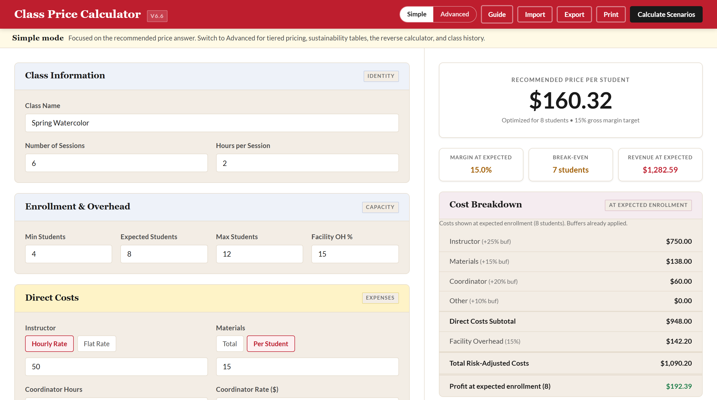
7 Results Panel
Click the "Calculate Scenarios" button in the crimson header bar. The right-side results panel populates with everything you need to make a pricing decision.
Price Hero
At the top you'll see the recommended per-student price, optimized for your expected enrollment and target margin. Below it, a subtitle confirms the enrollment count and margin target the price was built for. If tiered pricing is enabled, this section switches to show tier prices in side-by-side boxes (three or four, depending on your tier count) instead of a single number.
Stat Pills
Three compact indicators sit below the price:
- Margin at expected: The margin the recommended price actually delivers at your expected enrollment, with risk buffers applied. By construction it matches your target margin when nothing has changed since the last calculation, a quick read that the math still adds up. Color-coded green (20%+), amber (10-20%), or red (below 10%).
- Break-even: The number of students you need to cover all costs with zero profit. Green if it's at or below your minimum enrollment (great: you're safe even at your smallest class). Amber if between minimum and maximum. Red if above your maximum or infinite (meaning costs exceed revenue at every enrollment level).
- Revenue at expected: The total revenue the class brings in at your expected enrollment, calculated as price per student times expected students. The whole results panel is centered on the expected case; outlying scenarios (minimum, maximum, anything between) live in the Enrollment Scenarios table below.
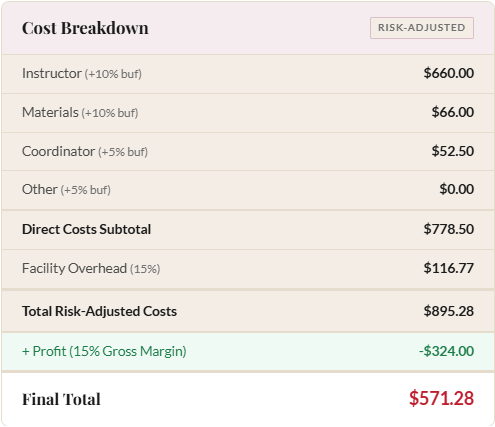
Cost Breakdown
Below the stat pills, the Cost Breakdown card lists every cost category with its buffer percentage in parentheses, followed by subtotals. Costs are shown at expected enrollment, the scenario your recommended price is calibrated to. The structure is:
- Instructor cost (with buffer)
- Materials cost (with buffer)
- Coordinator cost (with buffer)
- Other costs (with buffer)
- Direct Costs Subtotal
- Facility Overhead (percentage of direct costs)
- Total Risk-Adjusted Costs
- Profit at expected enrollment: the revenue you collect at expected enrollment minus the total costs above. This is the bottom-line answer to "what does this class earn at the scenario the price was built for?" Enrollment-level risk (what happens at minimum or maximum) is shown in the Enrollment Scenarios table below.
This is the detailed view of how your price was built. If something looks off, you can trace it back to exactly which input is driving the number.
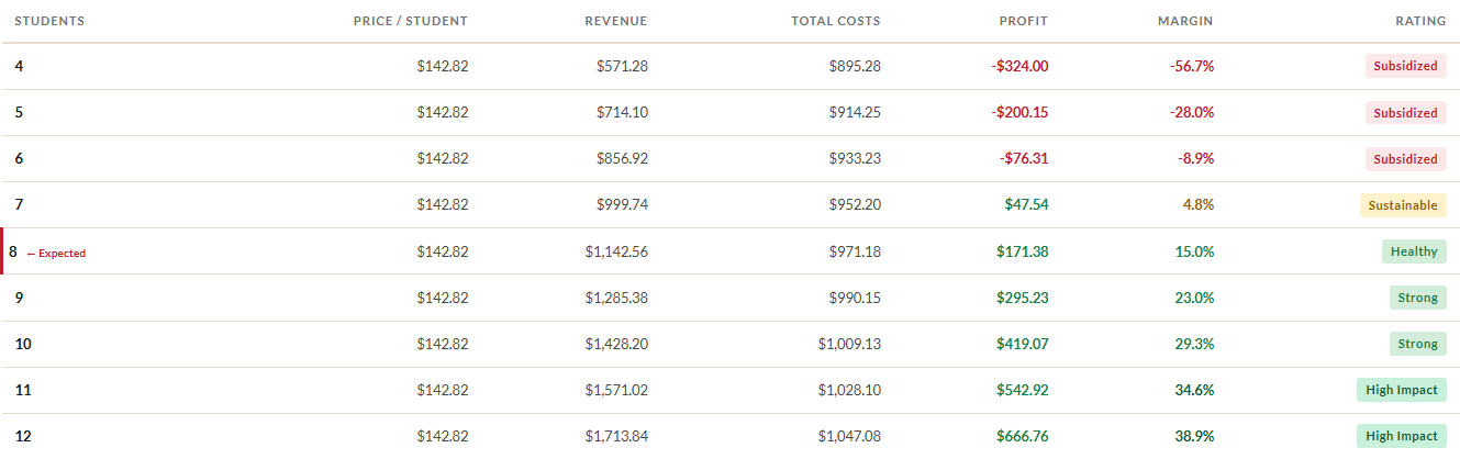
Enrollment Scenarios Table
Below the two-column layout, a full-width Enrollment Scenarios table shows a row for every student count from minimum to maximum. Each row includes:
- Number of students (the row matching expected enrollment is highlighted and tagged)
- Price per student (constant across all rows)
- Total revenue
- Total costs (which can change if you have per-student materials)
- Profit (green or red depending on whether it's positive or negative)
- Margin percentage (color-coded)
- A rating badge: Great, Good, Tight, or Loss
This table is the heart of the tool. It answers the question every program coordinator worries about: "What happens if only five students sign up?"
8 Target Price Analysis (Reverse Calculator)
The Reverse Calculator, located in the results panel below the cost breakdown, flips the question around. Instead of "What should I charge?", it answers "If I charge this specific amount, what happens?"
Enter a Target Price per Student (for example, $150), set a Min, Expected, and Max student range for the analysis, and click "Analyze Target Price." A summary line shows the profit at your expected enrollment at that price, the fast-track answer to "would this price work?" The table below breaks out revenue, costs, profit, margin, and a rating badge at every enrollment level, with the expected row highlighted so the panel and the breakout stay in conversation.
The extra column here is Markup Needed. This tells you how much you'd need to raise the target price to hit your desired margin at that enrollment level. If the markup is 0% or negative, you're already meeting or exceeding your target margin. If it shows 15%, you'd need to charge 15% more to reach your target margin at that student count.
When to Use It
The reverse calculator is perfect for benchmarking. If other programs in your community charge $150 for a similar class, type $150 and see whether that price works for your cost structure. If the margins are tight, you'll know exactly how tight, and you can make an informed decision about whether to absorb the difference, reduce costs, or justify a higher price with better marketing.
When tiered pricing is enabled, the tool also shows the supported and supporter prices derived from your target price (using the same discount and premium percentages), so you can see the full tier spread at any price point you're considering.
9 Sustainability Analysis
When tiered pricing is enabled and scenarios have been calculated, the Supported-Seat Sustainability table appears below the enrollment scenarios. This is one of the most important tables in the tool for organizations offering sliding-scale pricing.
For each enrollment level from minimum to maximum, it shows two key numbers:
- Max Supported (Break-even): The maximum number of students who can pay the supported price before the class starts losing money, assuming everyone else pays the standard price (not the supporter premium).
- Max Supported (Target Margin): The maximum number of supported-price students you can absorb while still hitting your target gross margin.
Each number is also shown as a percentage of total enrollment. So if the table shows "3 (37%)" for an 8-student class at break-even, it means you can offer supported pricing to 3 out of 8 students before the class loses money.
The table uses a deliberately conservative assumption: it pretends that no one pays the supporter premium. Every non-supported student pays exactly the standard price. In practice, if some students choose the supporter tier, your capacity for supported seats is higher than what the table shows. Conservative is safer for budget planning.
A similar sustainability table appears below the reverse calculator results, showing the same analysis at your target price instead of the calculated price. The expected enrollment row is highlighted for quick reference.
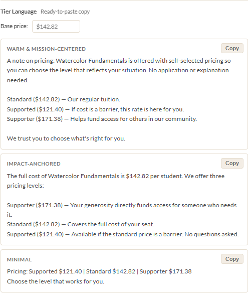
10 Tier Framing Language
Once you've calculated scenarios with tiered pricing enabled, the Tier Language section appears in the results panel. This generates ready-to-paste copy for your registration page, catalog, or email announcement. You don't have to write the language yourself.
Three Styles
The tool offers three framings, each presented as a card with a "Copy" button:
- Warm & Mission-Centered: Emphasizes community, accessibility, and shared values. Good for organizations whose audience connects with mission-driven language and appreciates knowing why tiers exist.
- Impact-Anchored: Leads with what the supporter contribution makes possible. Good for audiences who want to know exactly where their extra dollars go and what impact they're having.
- Minimal: Just the tiers and prices, no framing. Good for contexts where less is more: a simple price list, a compact web form, or a registration platform that doesn't have room for prose.
Base Price Override
By default, the tier language uses your calculated standard price. But calculated prices are often not round numbers. If you want to round up from $187.50 to $190, or use a completely different price for marketing purposes, type it into the Base price field at the top of this section. The generated language updates immediately. The tool shows your original calculated price in parentheses next to the override so you can always see what the math produced.
Two-Tier Auto-Detection
If your Supporter Premium is set to 0%, the tool detects that you're running a two-tier model (Supported and Standard only). The generated language automatically adjusts to describe two options instead of three. This is especially useful when your registration or booking platform only supports two price codes.
Copy to Clipboard
Each style card has a Copy button in the top corner. Click it and the generated text goes straight to your clipboard, ready to paste into your website, email template, or registration platform. The button briefly changes to "Copied!" for confirmation, then reverts after about a second and a half.
11 Post-Class Review
Pricing gets better with practice, but only if you track what actually happened. The post-class review system closes the loop between your predictions and reality.
Saving a Plan
After you calculate scenarios, a Save to Class History prompt appears in the results panel. Enter a Term label (like "Summer 2026" or "Fall Session A") and click "Save to History." The tool snapshots your entire pricing configuration (all inputs, tier settings, predicted distribution, and calculated results) and stores it in your browser's localStorage.
Each saved plan gets a unique ID. You can save multiple pricing plans for different classes, or even multiple versions of the same class.
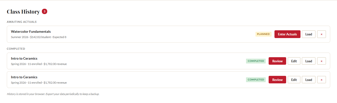
Class History Panel
Once you've saved at least one plan, the Class History section appears below the enrollment scenarios, with a count badge showing how many records you have. Saved classes are organized into two groups:
- Awaiting Actuals: Classes you've planned but haven't finished yet. Each card shows the class name, term, price per student, and expected enrollment. Buttons: "Enter Actuals" (record what happened), "Load" (reload this plan's inputs into the calculator), and delete.
- Completed: Classes where you've entered actual results. Each card shows the actual enrollment and revenue. Buttons: "Review" (see the comparison), "Edit" (update your actuals), "Load," and delete.
Entering Actuals
Click "Enter Actuals" on any planned class. A form appears asking for:
- Total Enrolled: How many students actually registered and paid.
- Supported Count, Standard Count, Supporter Count: How many students paid at each tier. The tool validates that these three numbers add up to Total Enrolled.
- Total Revenue ($): The actual revenue collected for this class.
- Notes: Optional free text. "Strong enrollment, more supported than expected" or "Three last-minute cancellations."
Click "Save Actuals" and the class moves from Awaiting Actuals to Completed.
Comparison View
Click "Review" on any completed class to see a side-by-side comparison of your predictions versus reality. The comparison view shows four cards:
- Enrollment: Predicted vs. actual count, with a delta (color-coded green for higher, red for lower).
- Revenue: Predicted vs. actual revenue, with a delta in dollars.
- Predicted Split: The tier percentages you used when planning.
- Actual Split: The real tier percentages based on your actuals, with deltas showing the difference.
This is where the learning happens. If you predicted 25% supported and the actual was 35%, you now know to adjust your distribution for the next similar class.
Aggregate Learning
After you've completed 3 or more classes with actuals, the tool calculates your real tier distribution across all completed classes and displays an Aggregate Card at the top of the Class History section. This card shows your actual supported/standard/supporter split, computed from real data across all your classes, along with total class count and total students served.
Click "Use My Data as Default" to replace the predicted distribution fields (25/65/10) with your community's actual numbers. From that point forward, every new class you price will use your real tier behavior instead of research averages. Your data is almost always more accurate than a national average.
12 Export, Import, and Print
At the bottom of the left input panel, three buttons handle data portability.
Export JSON
Click "Export JSON" to download a .json file containing all your current inputs, calculated scenarios, class history, and user defaults. This is your backup. If you switch browsers, clear your cache, or want to share a pricing configuration with a colleague, export first.
Import JSON
Click "Import JSON" and select a previously exported file. The tool merges the imported data with your current state. For class history, it deduplicates by record ID, so importing the same file twice won't create duplicate entries. Imports from v6.3 (which predates class history) are handled gracefully. The tool ignores missing fields and loads whatever data is available.
Print Summary
Click "Print Summary" to open a print-optimized layout in a new window. The print version is organized into two pages:
- Page 1: Enrollment scenarios table and supported-seat sustainability analysis.
- Page 2: Target price analysis, reverse sustainability, and predicted tier distribution.
The print layout strips out interactive controls, input fields, and navigation. It reformats tables for paper and includes only the data you'd present in a budget meeting or share with a decision-maker. It works well as a PDF export too: just choose "Print to PDF" from your browser's print dialog.
A note on browser storage: your class history and user defaults live in localStorage, which means they stay in your browser on your computer. They are not synced to the cloud or to other devices. Exporting your data periodically is the only way to back it up. We recommend exporting after every class you complete.
Ready to price your next class?
Open the Class Price Calculator and put this guide into practice.
Open the Calculator